It doesn’t take long to get me ranting and raving about how bloody fantastic the film Moon is. In addition to being a thoughtful science fiction film, spearheaded by an amazing performance by the always excellent Sam Rockwell, it is also a beautifully shot film with a colour palette that does a shitload with very little. Space is one hell of an isolated place, and the incredibly utilitarian look of the Sarang combined with the sparseness and contrast of the moon’s surface against the blackness of space, is incredibly effective not to mention visually striking. In my books it’s nigh on being the perfect theoretical depiction of life in space. And that’s high praise for a medium that has the equivalent of a rip-roaring erection for the extra-terrestrial.
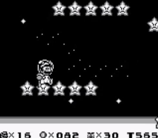
Video games, like film, too have a fascination with the great expanse above our atmosphere. While utilitarian by virtue of its technical constraints, Super Mario Land 2 for mine captures that same sparseness one would expect from the moon. As undoubtedly one of the prettiest games on the Game Boy, it may seem a bit strange to talk about the least graphically impressive part of the game, but there’s just something about the Space Zone that hits all of my lo-fi space-loving buttons. The (incredibly) limited colour palette works to create one mighty desolate lunar world, while at the same time capturing the beauty of the ‘universe’ that has had humanity gazing up at the stars probably since the moment we evolved to have eyes. It is entirely accidental, of course, but the monochromatic constraints of the Game Boy delivered the same amazing minimalist vision of space that Duncan Jones’ film so beautifully captured.
Although snot green wasn’t necessarily the most flattering of base colours, the high contrast on screen was enough for the mind’s eye to fill in the blanks, at least that was until the Game Boy Color with all its fancy palette swapping madness perfected the picture. It was finally the picture of black and white perfection I’d pictured all along. While the Pumpkin Zone levels had the same effect, with the way the various shades of grey – not quite 50 – are used to give the sensation of light peering in through windows or the gradual fading of light from wall-mounted torches, it isn’t quite as special as the graphical contrast between the moon’s surface and the star-spangled vacuum that is beautiful nothingness.
(It’s starting to sound a bit like I have a rip-roaring erection for the moon, isn’t it?)
In many ways all of humanity’s views of what it’s like to be on the surface of the moon come from that still pretty bloody amazing 1969 footage of the first man to set foot on our great celestial sidekick. But it’s an incredibly strong visual image that, until we have our own visual reference, is going to form the basis of any attempts to recreate it. It’s a beautiful image, really, and one that captures humanity’s imagination almost like no other. But while more modern games may do a better job of it – Gran Turismo 6’s bizarre but unbelievably striking journey to the moon comes to mind – I’ll always have an unrivalled fondness for Nintendo’s constrained but artistically beautiful vision of a man walking on the moon. Low-gravity and all.

Leave a Reply